


CLIENTE / CLIENT:
AGR! Food Marketing
year: 2016.
AGR! Food Marketing
year: 2016.
Creative Direction and design: Ana Vañó (UVE) Francés, Cristina Toledo
Project by nueve estudio
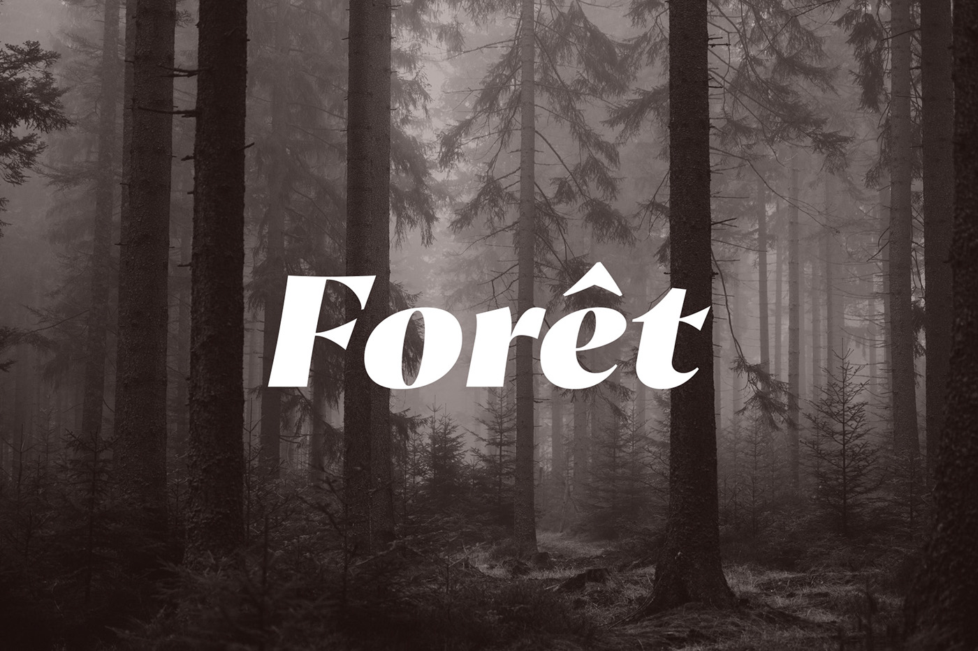
Forêt:
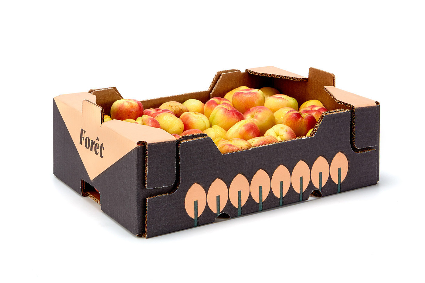
In collaboration with AGR Food Marketing agency we have developed the naming, branding and packaging for a new fruit brand with a premium target audience in foreign markets. On one side, an apricot brand – escande variety, which is the star fruit of the company. And on the other side, another brand covering the rest of the premium fruits: other apricot varieties, pears, kakis and saturn peaches.
Naming
Sophistication. French term meaning ‘forest’ in French. The ‘escande’ apricot variety comes from France. Also, the apricots Forêt de Vallcostera are mostly grown on a hill area, surrounded by pine trees and mountains.
There is also the story of the ‘apricot forest’.
There is also the story of the ‘apricot forest’.
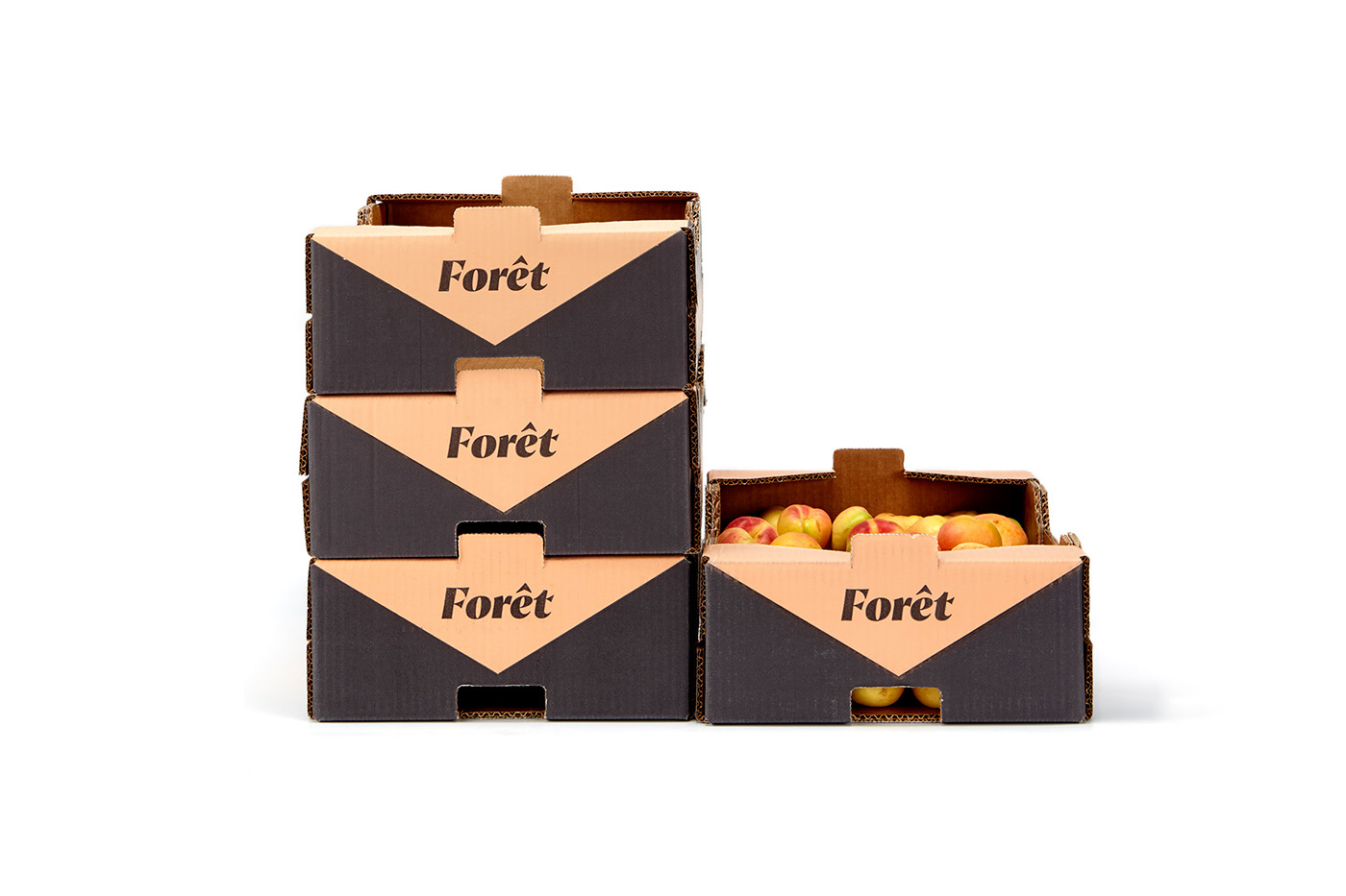
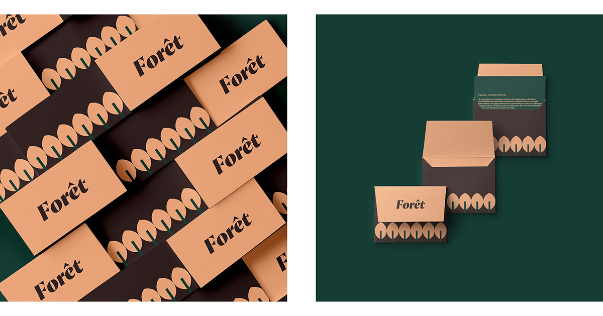
Branding and packaging:
To reference the French origin of the naming, an emphatic as well as sophisticated font has been chosen, giving the brand its premium character. The selected palette fpr Fôret comes fround the ground and the fruit. A soft ‘apricot’ colour and a dark earth colour. Premium colours, far from the traditional black and gold combination.
As for the packaging, we have been in charge of the design as well as the production. A graphic representation of a forest, using basic geometric shapes giving it a premium yet casual character.
As for the packaging, we have been in charge of the design as well as the production. A graphic representation of a forest, using basic geometric shapes giving it a premium yet casual character.


thanks! for watching


